PeakWeather Demo
[2]:
from peakweather import PeakWeatherDataset

import matplotlib.pyplot as plt
Loading the data
To get the dataset, simply initialize a PeakWeatherDataset object. This will, by default, download the data in the current working directory, unless it was previously downloaded.
[2]:
dataset = PeakWeatherDataset()
With get_observations you can load the timeseries data as a dataframe or array. It is possible to only load spatial and temporal subsets and obtain a binary mask that determined the availability of each measurement.
[3]:
df, mask = dataset.get_observations(
    stations=['ABO', 'GRO'],                   # list of stations
    parameters=['temperature', 'wind_speed'],  # list of weather variables
    first_date='2024-08-02 16:32',
    last_date='2024-08-06 23:26',
    return_mask=True
)

df.head(5)
[3]:
| nat_abbr | ABO | GRO | ||
|---|---|---|---|---|
| name | temperature | wind_speed | temperature | wind_speed |
| datetime | ||||
| 2024-08-02 16:40:00+00:00 | 19.400000 | 2.0 | 24.100000 | 0.8 |
| 2024-08-02 16:50:00+00:00 | 19.600000 | 2.7 | 23.100000 | 0.9 |
| 2024-08-02 17:00:00+00:00 | 19.200001 | 2.0 | 22.900000 | 1.4 |
| 2024-08-02 17:10:00+00:00 | 19.000000 | 0.9 | 23.000000 | 2.3 |
| 2024-08-02 17:20:00+00:00 | 19.100000 | 1.5 | 22.799999 | 2.3 |
[4]:
mask.head()
[4]:
| nat_abbr | ABO | GRO | ||
|---|---|---|---|---|
| name | temperature | wind_speed | temperature | wind_speed |
| datetime | ||||
| 2024-08-02 16:40:00+00:00 | True | True | True | True |
| 2024-08-02 16:50:00+00:00 | True | True | True | True |
| 2024-08-02 17:00:00+00:00 | True | True | True | True |
| 2024-08-02 17:10:00+00:00 | True | True | True | True |
| 2024-08-02 17:20:00+00:00 | True | True | True | True |
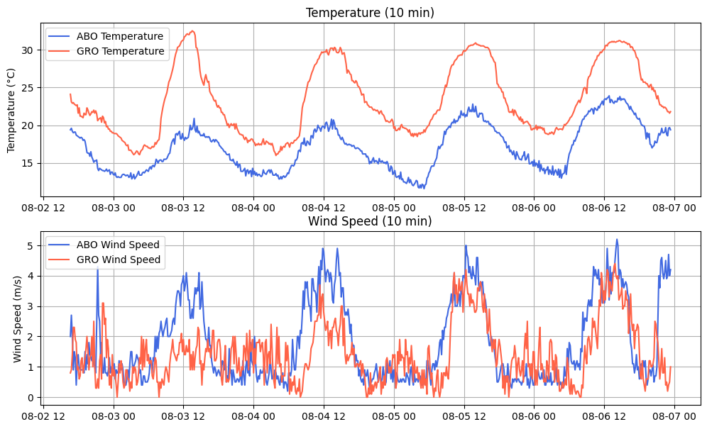
Visualization of the data
[5]:
fig, ax = plt.subplots(2, figsize=(12,7))

# Plot temperature
ax[0].plot(df.index, df['ABO', 'temperature'], label='ABO Temperature', color='royalblue')
ax[0].plot(df.index, df['GRO', 'temperature'], label='GRO Temperature', color='tomato')
ax[0].set_title('Temperature (10 min)')
ax[0].set_ylabel('Temperature (°C)')
ax[0].legend()
ax[0].grid(True)

# Plot wind speed
ax[1].plot(df.index, df['ABO', 'wind_speed'], label='ABO Wind Speed', color='royalblue')
ax[1].plot(df.index, df['GRO', 'wind_speed'], label='GRO Wind Speed', color='tomato')
ax[1].set_title('Wind Speed (10 min)')
ax[1].set_ylabel('Wind Speed (m/s)')
ax[1].legend()
ax[1].grid(True)

plt.show()
Time series windowing
The get_windows function extracts sliding windows from the time series using a look-back window w and forecast horizon h This prepares the data in a format that’s easy to use with framework-specific datasets and data loaders (e.g., PyTorch, TensorFlow, JAX).
This returns arrays of shape [n_w, w, n_s, n_f] for the inputs x and [n_w, h, n_s, n_f] for the outputs y, where n_w is the number of windows (or examples/samples), n_s is the number of stations and n_f is the number of features.
[6]:
lookback_size = 24
horizon_size = 6

windows = dataset.get_windows(
    window_size=24,  # number of lookback time steps
    horizon_size=6,  # number of lead times to be predicted
    parameters=['temperature', 'wind_speed', 'humidity'],
    stations=['ABO', 'KLO', 'GRO', 'LUG']
)

print(f"Windows x shape: \t{windows.x.shape}")
print(f"Windows mask_x shape: \t{windows.mask_x.shape}")
print(f"Windows y shape: \t{windows.y.shape}")
print(f"Windows mask_y shape: \t{windows.mask_y.shape}")
Windows x shape:        (433699, 24, 4, 3)
Windows mask_x shape:   (433699, 24, 4, 3)
Windows y shape:        (433699, 6, 4, 3)
Windows mask_y shape:   (433699, 6, 4, 3)
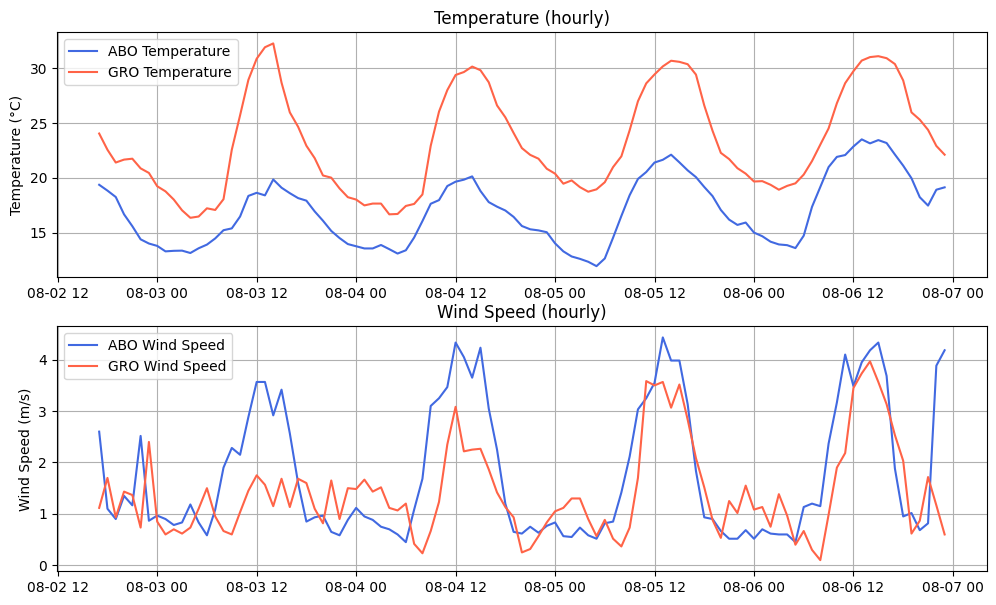
Temporal re-sampling
We can initialize the dataset to resample the time series to a coarser frequency, such as from the default 10-minute interval to hourly. This is useful for reducing the variability of highly dynamic variables like wind speed, aligning with lower temporal resolutions, or shortening sequence length for training.
Each variable has a default aggregation method used during temporal resampling, which can be overridden using the aggregation_method parameter.
[7]:
dataset = PeakWeatherDataset(
    freq='h',
    aggregation_methods={'temperature': 'mean',
                         'humidity': 'mean'}
)
Just like before, let’s look that temperature and wind speed for the stations of Adelboden and Grono, this time with an hourly temporal resolution.
[8]:
df, mask = dataset.get_observations(
    stations=['ABO', 'GRO'],
    parameters=['temperature', 'wind_speed'],
    first_date='2024-08-02 16:32',
    last_date='2024-08-06 23:26',
    return_mask=True
)
[9]:
fig, ax = plt.subplots(2, figsize=(12,7))

# Plot temperature
ax[0].plot(df.index, df['ABO', 'temperature'], label='ABO Temperature', color='royalblue')
ax[0].plot(df.index, df['GRO', 'temperature'], label='GRO Temperature', color='tomato')
ax[0].set_title('Temperature (hourly)')
ax[0].set_ylabel('Temperature (°C)')
ax[0].legend()
ax[0].grid(True)

# Plot wind speed
ax[1].plot(df.index, df['ABO', 'wind_speed'], label='ABO Wind Speed', color='royalblue')
ax[1].plot(df.index, df['GRO', 'wind_speed'], label='GRO Wind Speed', color='tomato')
ax[1].set_title('Wind Speed (hourly)')
ax[1].set_ylabel('Wind Speed (m/s)')
ax[1].legend()
ax[1].grid(True)

plt.show()
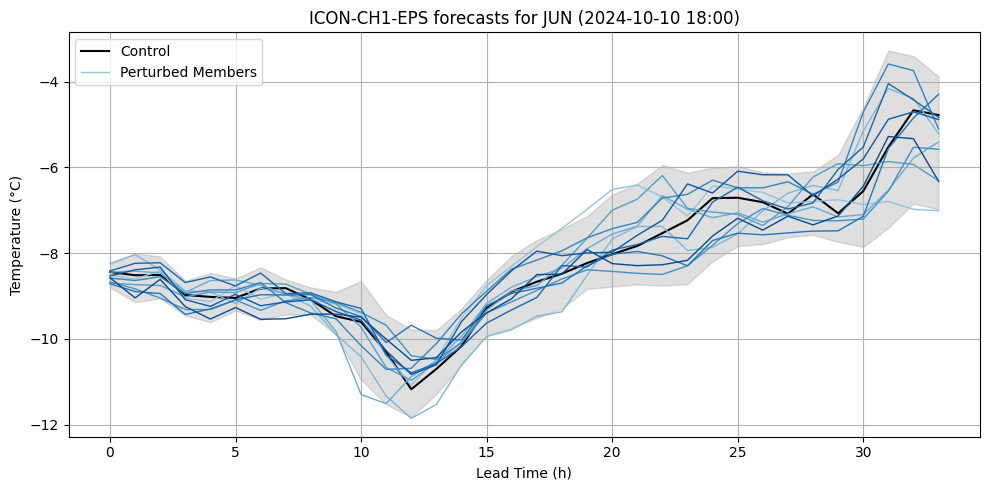
ICON data
The dataset is complemented by the operational forecasts of the numerical weather prediction model ICON-CH1-EPS starting from May 2024. The data is available for all variables with the prediction interpolated to the closest grid cell to each station.
It comes in the form of an Xarray dataset with dimensions [lead,nat_abbr,realization,reftime] where each realization is one of the 11 ensemble members produced by the model.
To obtain this data, the PeakWeather library needs to be installed with the extra dependency “topography”. This will install Xarray and Zarr.
[5]:
ds = PeakWeatherDataset(extended_nwp_vars='all',
                        extended_topo_vars='all',
                        freq='h')
[6]:
ds.available_icon
[6]:
{'ew_wind',
 'humidity',
 'nw_wind',
 'precipitation',
 'pressure',
 'sunshine',
 'temperature',
 'wind_gust'}
[ ]:
icon_data = ds.get_icon_data('temperature')
[44]:
icon_data
[44]:
<xarray.Dataset> Size: 1GB
Dimensions:      (lead: 34, nat_abbr: 302, realization: 11, reftime: 2557)
Coordinates:
  * lead         (lead) timedelta64[ns] 272B 00:00:00 ... 1 days 09:00:00
  * nat_abbr     (nat_abbr) <U5 6kB 'ABE' 'ABO' 'AEG' ... 'ZEV' 'ZWE' 'ZWK'
  * realization  (realization) int64 88B 0 1 2 3 4 5 6 7 8 9 10
  * reftime      (reftime) datetime64[ns] 20kB 2024-05-15T12:00:00 ... 2025-0...
Data variables:
    temperature  (reftime, lead, nat_abbr, realization) float32 1GB ...
Attributes:
    LICENSE:    CC-BY-4.0
    parameter:  Air temperature
    period:     2024-05:2025-03
    source:     MeteoSwiss (ICON-CH1-EPS)
time_zone: UTC[46]:
from matplotlib import cm
import numpy as np

reftime = '2024-10-10 18:00'
station_name = 'JUN'
ensembles = icon_data.sel(nat_abbr=station_name, reftime=reftime).to_array().data[0]


lead_times = np.arange(ensembles.shape[0])

n_ensembles = ensembles.shape[1]
colors = cm.Blues(np.linspace(0.4, 0.9, n_ensembles -1 ))

fig, ax = plt.subplots(figsize=(10, 5))

for i in range(n_ensembles):
    if i == 0:
        ax.plot(ensembles[:, i], color='black', linewidth=1.5, label='Control')
    else:
        label = 'Perturbed Members' if i == 1 else None
        ax.plot(ensembles[:, i], color=colors[i - 1], linewidth=1, label=label)

mean = np.mean(ensembles, axis=1)
std = np.std(ensembles, axis=1)
ax.fill_between(lead_times, mean - 2*std, mean + 2*std, color='grey', alpha=0.25)

ax.set_title(f"ICON-CH1-EPS forecasts for {station_name} ({reftime})")
ax.set_xlabel("Lead Time (h)")
ax.set_ylabel("Temperature (°C)")
ax.grid(True)
ax.legend()

plt.tight_layout()
plt.show()
[ ]: